


- What is a bubble map, and how does it help crypto investors?
- How can you identify risky or concentrated token ownership using a bubble map?
- What are some common patterns or shapes in bubble maps, and what do they indicate about token distribution?
- Which platforms and tools integrate bubble maps to help investors analyze crypto tokens?
- Why has the use of bubble maps changed the way individual investors approach cryptocurrency markets?
Sarah Mitchell almost lost $3,000 last year. A new cryptocurrency token promised revolutionary technology, had a fantastic website, and investors were already boasting about returns. Sarah contemplated putting a part of her savings into the token.
Then, a colleague advised her to check bubble maps for more information about the token. Sarah had never heard of them, but she decided to explore the option. She copied the token’s contract address and pasted it into a free website called Bubblemaps.io. As soon as she did this, three enormous circles appeared on her screen, connected by thick lines. The three circles showed that three wallets held almost 70% of the token supply. Everyone else—thousands of tiny dots—owned mere scraps.
Sarah decided not to buy the token. Two weeks later, those three wallets sold most of the supply. The token crashed by 87% overnight. The bubble map saved Sarah from a disaster she otherwise would not have seen coming.
The Problem Nobody Talks About
Cryptocurrency runs on a strange contradiction. Everything is supposed to be transparent, as every transaction is recorded on public blockchains. Yet most people have no clue how to read this data and, more importantly, how to interpret it.
Wallet addresses look like many letters jumbled together. For instance, an address can be 0x742d35Cc6634C0532925a3b844Bc9e7595f0bEb. Transaction histories scroll forever with so many codes. Making sense of raw blockchain data takes programming skills or hours of tedious technical work. This creates perfect ground for manipulation. Insiders who can read blockchain data spot opportunities that are invisible to regular investors. It’s like playing poker, where some players see everyone’s cards.
Bubble maps flip this situation. Instead of incomprehensible data, users can see circles representing wallets, sized by how many tokens they hold. Lines connect wallets that trade with each other.
The concept is not new. Police have used various networks for decades, connecting suspects through phone records. Epidemiologists have long tracked pandemics the same way, charting infection chains through patient interviews. Bubble maps just apply the same idea to crypto: show the connections, and then the patterns are visible to a common user.
The Biggest Bubble Of All
Bubblemaps.io pioneered this space in 2022 when its founders grew frustrated with manual spreadsheet analysis of blockchain data. Users simply paste a token’s contract address into the search bar of the website, and it generates an interactive ownership map, visualizing wallet connections and holdings. The free version supports basic research needs, while paid subscriptions unlock advanced features like historical snapshots and cross-token/multi-chain tracking. Most individual investors don’t require the extra features.
To work seamlessly, bubblemaps.io pulls raw transaction data from blockchain networks. Its software processes thousands of transactions from the blockchain, finds patterns like groups of wallets and money movements, and creates an easy-to-understand visual map—something that would take a researcher hours to do manually.
A tool empowering others also
DexTools—one of the most popular analytics platforms for decentralized exchanges—has integrated bubblemaps.io’s visualization tools into its interface, which traders use for real-time price charts and pair insights. In DexTools, the use of bubble maps is more to find out trading dynamics than mere ownership, mapping out wallet interactions and transaction flows to uncover behavioral patterns.
Many others are using bubblemaps.io to give better information to their users. DEX Screener, the leading real-time charting tool, and Layer-2 blockchain Base embed Bubblemaps directly on every token page so traders can instantly see wallet clusters and holder connections without leaving the chart view.
Etherscan now displays Bubblemaps on Ethereum and EVM-chain token/contract pages, giving millions of daily users one-click access to visual distribution and historical snapshots. Binance Web3 Wallet rolled out a native Bubblemaps integration in October 2025, allowing users to analyze token ownership, wallet relationships, and past distributions straight from inside the wallet interface.
On Solana, both Pump.fun (the largest memecoin launchpad) and Photon (a high-speed trading terminal) have added Bubblemaps to new token pages to highlight concentration risks and insider clusters within seconds of launch.
Other notable adopters of bubblemaps.io include CoinGecko (for token overview), Ave.ai (for multi-chain trading aggregation), and Gem.xyz, as well as OpenSea Pro (for NFT collection holder mapping). Blockchain data browsers like Solscan, BscScan, and Arbiscan have also added a Bubblemaps button on every token page.
It’s not the only bubble in the market
A few alternatives exist besides Bubblemaps.io. TokenSniffer is a free scam checker that gives every token a safety score and a quick bubble map of the top 100 holders—orange bubbles are the creators, red ones are burned coins, and too many lines back to the creator usually means trouble.
InsightX works almost exactly like Bubblemaps: paste any token address, and get big colorful bubbles showing who really owns the coin across Solana, Ethereum, Base, and more. The basic version of this is also completely free.
Crypto Bubbles is different—it shows the whole crypto market in one picture, with bubbles growing or shrinking as prices pump or slump, perfect for seeing what’s hot right now. But it is not the tool for checking who owns a specific coin.
Finally, Nansen is the expensive “pro” tool used by big traders. It labels every wallet with names like “Whale,” “Insider,” “Binance Deposit,” or even “Justin Sun,” so anyone can instantly know who’s buying. Instead of basic bubble maps, it shows flowing lines of money moving from one coin to another in real time. It is a great tool if you have a high spending capacity, but regular investors rarely need it.
Reading The Crypto Bubble
A bubble map is a powerful tool when you know how to read it properly—and luckily, it’s very easy to learn. Here are a few simple steps for using it like a pro:
Go to bubblemaps.io on your phone or computer, and sign up.
Grab a token’s contract address. Projects post it on their website, or you can also get it online from websites like CoinGecko or the project’s official X account.
On the homepage of bubblemaps.io, paste the address of the token in the search bar, and hit enter. Boom—a colorful bubble map loads instantly, showing big holders (fat bubbles), wallet connections (lines), and clusters (insiders or whales). Zoom or click on the bubbles to get more details.
When you look at the map, some questions may come to your mind. Does it look organic? Why are the bubbles scattered randomly? What do the large bubbles clustered together mean?
Reading and understanding a bubble map is not tough. A larger bubble indicates that the corresponding wallet controls more tokens. Simple.
Now watch the lines: thick, glowing connections between giant bubbles almost always mean one person (or a tight group) is running dozens of wallets. They are shuffling coins around to fake “decentralized” ownership. In crypto terminology, this is a classic rug-pull setup.
When the biggest bubbles sit quietly with thin or no lines linking them, you’re looking at genuine, independent whales who bought and are holding separately. This distribution type provides comfort to experienced traders.
Colors matter. Most platforms use green for profitable positions and red for losses. If large holders show deep green while small holders show mixed or red, whales accumulated early and cheap, while regular investors bought high. This means a classic dump setup.
The timeline feature is also very useful. A user can rewind to launch and watch how the map evolved. Did large holders accumulate gradually alongside everyone else? Did large holders acquire significant positions right away and then remain inactive while others traded?
To learn more, users can compare bubble map depictions against marketing claims. If the team emphasizes decentralized community ownership but the map shows 70% in connected wallets, then it poses a problem. If they claim locked liquidity but bubbles show active large-scale trading, then again something is wrong.
Some patterns keep appearing in bubble maps, and it is a good idea to know them. Here is a quick look at these:
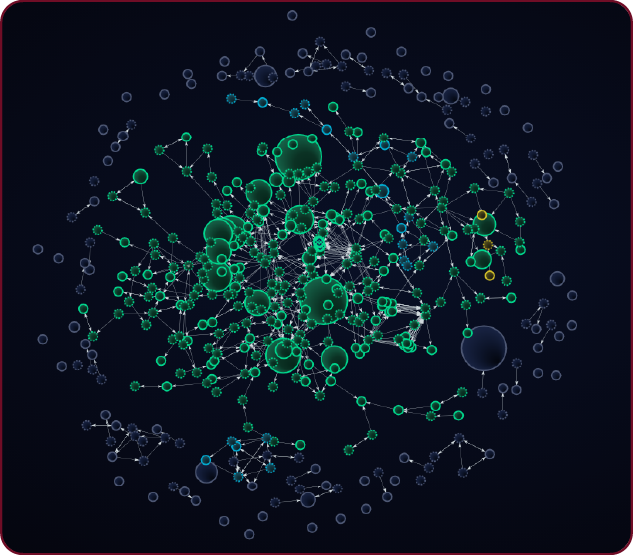
The Octopus: It is one enormous central bubble with medium-large bubbles connected like tentacles. Usually, this represents the main developer wallet, which is connected to team members or controlled addresses. Small independent holders scatter around the edges, unconnected.
The Constellation: Multiple large bubbles clustered together with thick connections, separated from small holders. Indicates coordinated wallets or one entity controlling multiple addresses.
The Time Bomb: Large holders who grabbed everything at launch for pennies, then went dormant. No buying, no selling, just holding. Meanwhile, thousands of small wallets appear over weeks, which are regular investors who bought at increasing prices.
The Dormant Swarm: This shows a handful of giant whales who got a token at launch, then froze—no trades, no lines, just silent shadows on the map. When they finally dump in unison, the price doesn’t dip, but it free-falls, and liquidity vanishes in seconds.
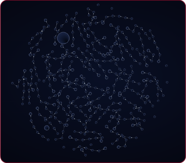
The Balanced Archipelago: This shows lots of medium-sized bubbles spread all over the map—no giant monsters. There are only a few thin lines going back and forth, plus steady little arrows coming in from exchanges. The biggest bubbles stay under 5–10%, so no single whale can wreck it. That’s what a real, fair coin looks like!
The Bigger Shift
Indeed, knowing how to read a bubble map adequately can help a crypto buyer avoid investing in risky projects. Bubble maps represent more than just a useful tool; they symbolize how access to information is changing in the crypto market. markets.
Industry players agree unanimously that bubble maps have democratized access to professional-grade information. What required custom software or programming knowledge now takes five minutes with a free tool. This innovation has had a real impact. Several high-profile scams in 2024 collapsed faster than similar schemes in previous years, partly because bubble maps let regular investors spot red flags before they committed their hard-earned money. Projects can no longer hide obvious concentration, as anyone can check.
Bubble maps make blockchain transparency actually work. They convert theoretical openness into practical utility.
Therefore, before any crypto investment, check the bubble map. Sarah now checks bubble maps before every crypto purchase. She has shown friends and family. Several have dodged questionable investments.
“It is like X-ray vision,” says an industry expert. “You see what’s underneath the marketing hype. Sometimes scary. Sometimes legitimate. Either way, you are deciding based on facts instead of hope.”
That shift—from hope to information—is bubble maps’ most valuable contribution. Bubble maps provide clarity about the current situation, rather than predicting future events. In markets where scams remain common, that clarity makes all the difference.